SELECTED WORK / Hospitality
Le More Hotel
Brand identity · Applications
DESIGN SCOPE
Logo · Wayfinding · Identity applications
Design material from the TPN portfolio.
SERVICES IN THIS PROJECT
Consistency from mark to space.
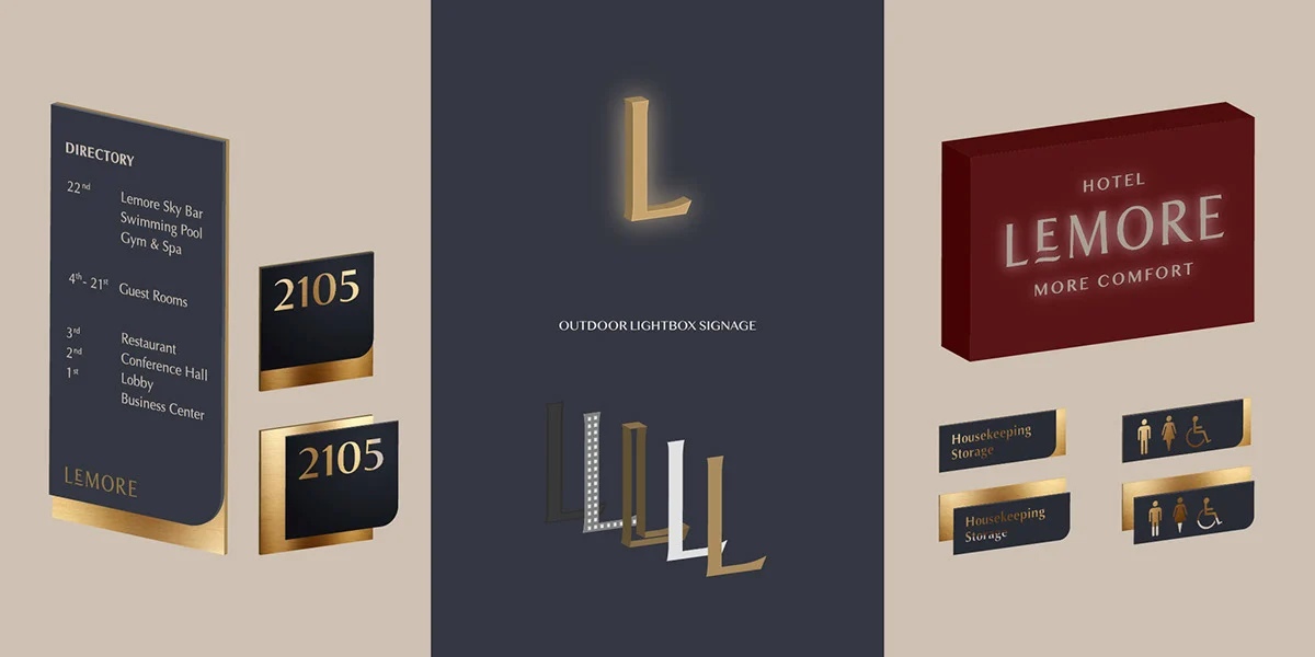
The visual language extends from the logo to signage and hotel touchpoints. Deep red, dark blue and gold establish a distinctive, balanced palette.
An identity needs to work both on its own and in its setting. Form, typographic proportions and materials support recognition and the experience of hotel guests.
Discuss a similar design