SELECTED WORK / Coffee
DROPCO
Brand identity · Packaging
DESIGN SCOPE
Brand identity and applications, including coffee packaging.
Design material from the TPN portfolio.
SERVICES IN THIS PROJECT
DROPCO — an identity in the world of coffee
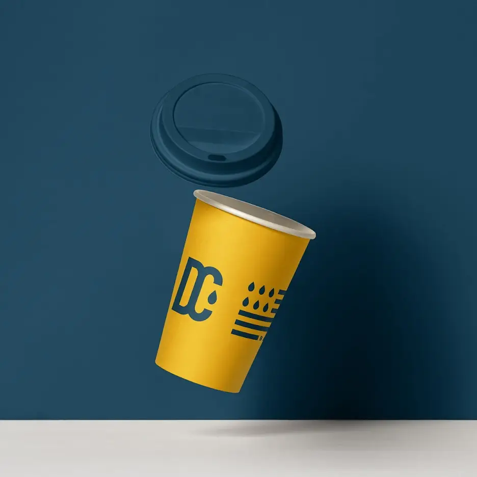
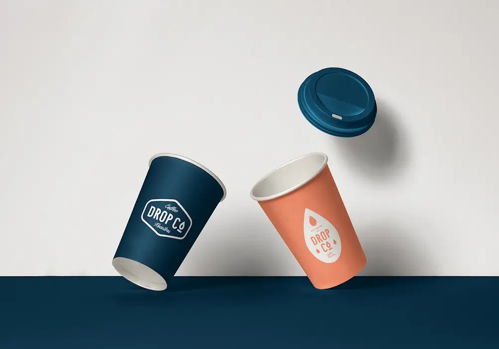
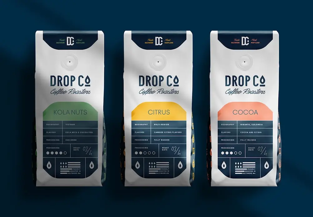
Deep green is paired with yellow, orange and lime accents. The identity appears on bottles, cups, coffee bags and printed materials.
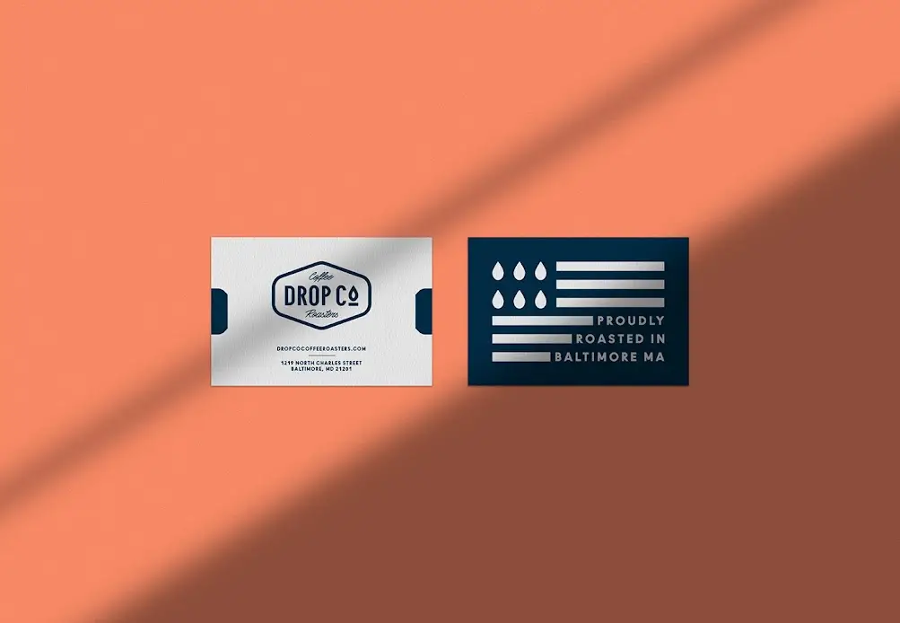
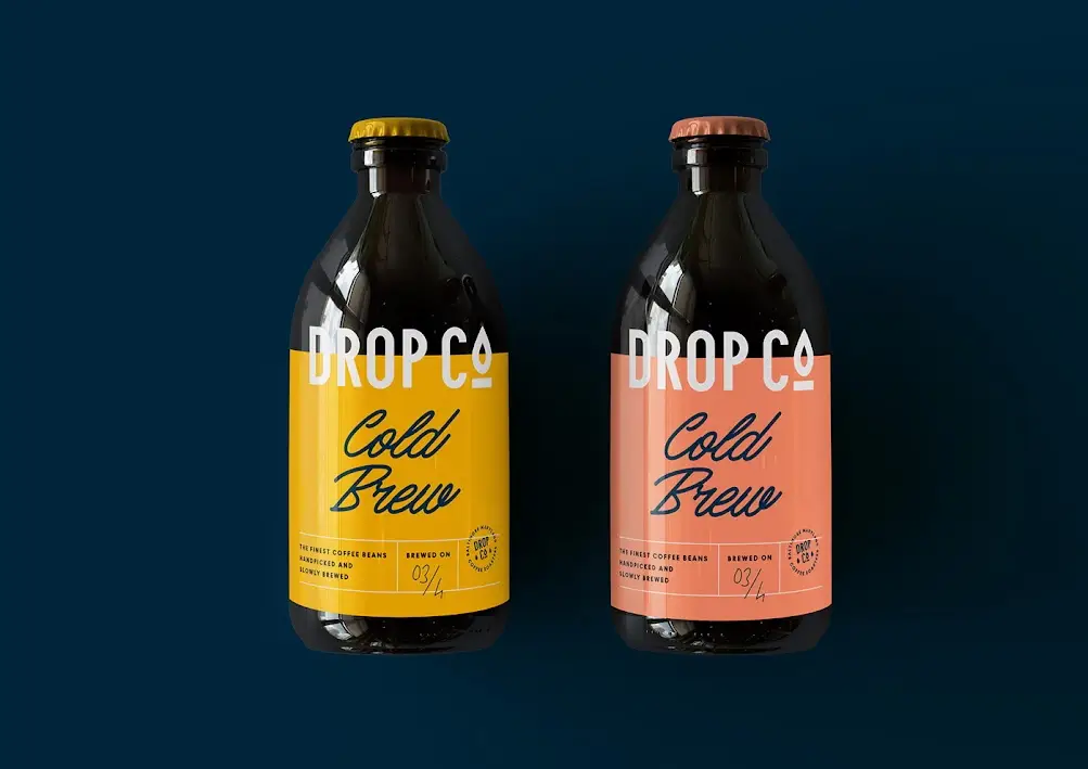
The DROPCO images connect the drop symbol, abbreviated lettering and clearly contrasting areas of colour. A shared graphic language is applied to different surfaces, from bottle labels to takeaway cups.
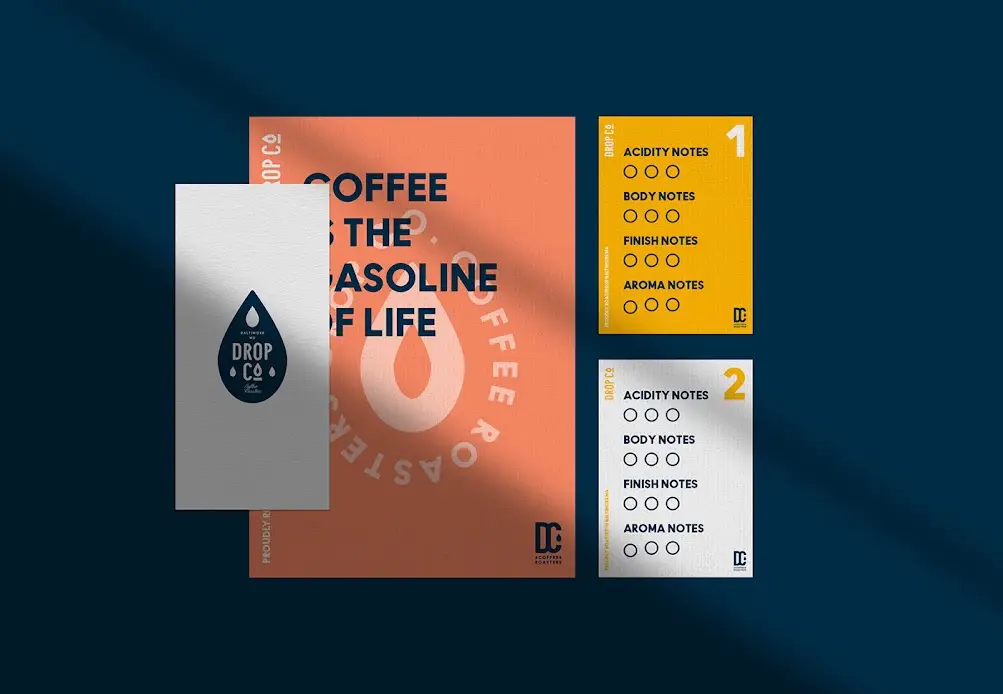
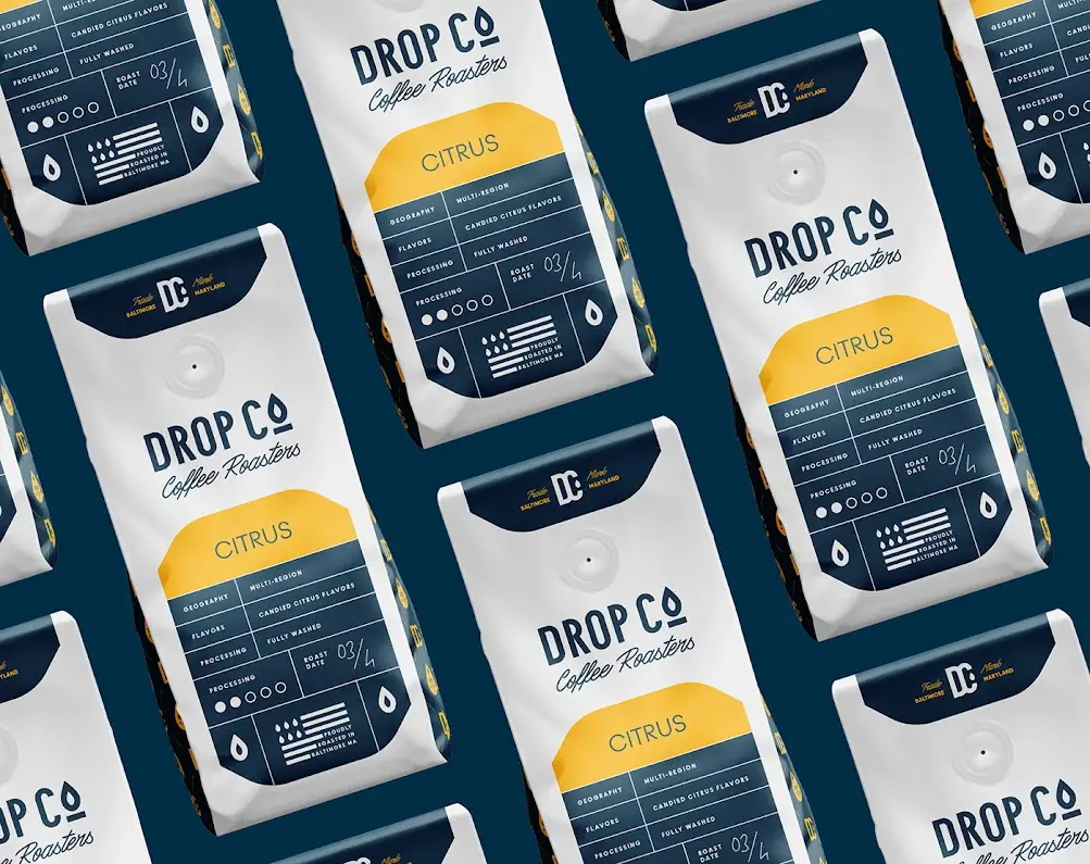
Coffee bags are distinguished by colour while retaining a similar information layout. Business cards and printed materials continue these cues, presenting an identity with a range of applications.
From bottle labels to coffee bags and small printed pieces, the applications show how a graphic system extends across surfaces and scales. Each group of images offers another view of the same identity.